Inhale. Exhale. andhale.
andhale is on a mission to make purpose-driven habits a core part of self-care.
The brand’s hero product line is focused on enhancing self-care routines: custom-blended aromatherapy oils with gemstone applicators. We were brought in during the early stages of brand development, defining foundational strategy and core tenets alongside a new brand name. The goal was to create a holistic identity that was earthy, grounded, and approachable while maintaining a premium look + feel. The brand extends across various touchpoints, from packaging to product display pages to social posts.
andhale
CLIENT
2022
2023
YEAR
Strategy
Naming
Visual Identity
Packaging Design
Packaging Production
Photo Art Direction
Styling + Post-Production
Web Design
Social Assets
Launch
SERVICES

NAMING + BRAND IDENTITY
The brand’s original name, Mindful Harmony, had major hurdles: Competitors frequently used the words ‘mindful’ and ‘harmony’ as descriptors and product names. Beyond that, we already knew the product format — an 8ml rollerball — and the packaging’s petite primary display panel would only highlight the difficulty of a long name.
Playing off the idea of rituals and breathwork, the name andhale was the perfect fit — a more abstract, unique brand name that enhanced the product benefit, allowed for a larger footprint on-pack, and was broad enough for future product development.
The logotype is feminine yet strong, with each letter tapering and ending with delicate tails that represent inhales & exhales. The mark is a combination of several types of flowers and gem elements, creating an art deco-inspired mark imbued with meaning that ties back to the brand.


PACKAGING DESIGN + PRODUCTION
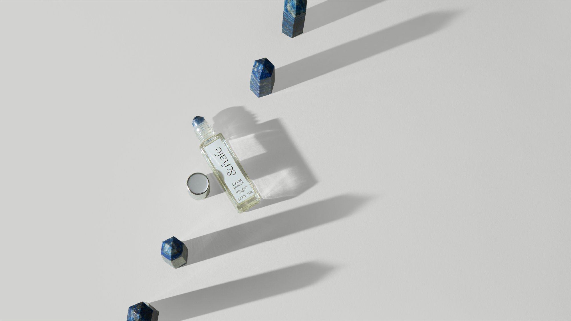
Key material decisions had been made prior to brand development — an earthy, recycled kraft board had been purchased in bulk alongside silver-capped rollerballs. These two elements quickly became a consistent factor between the primary and secondary packaging; floral photography printed directly on the recycled board creates depth and visual interest, highlighting a key ingredient in each blend. Silver foil logos connect back to the applicator and add a luxe, stand-out moment to the front-of-pack.
Ethical and sustainable practices are a key tenet for the brand, and the packaging is no exception. The FSC-certified board is made from recycled materials, and selections like glass componentry and soy-based inks ensure recycling is easy.


DRIVING TO LAUNCH
With the brand and packaging set, we moved into final elements to prepare for launch: photography, the website, and social media assets.
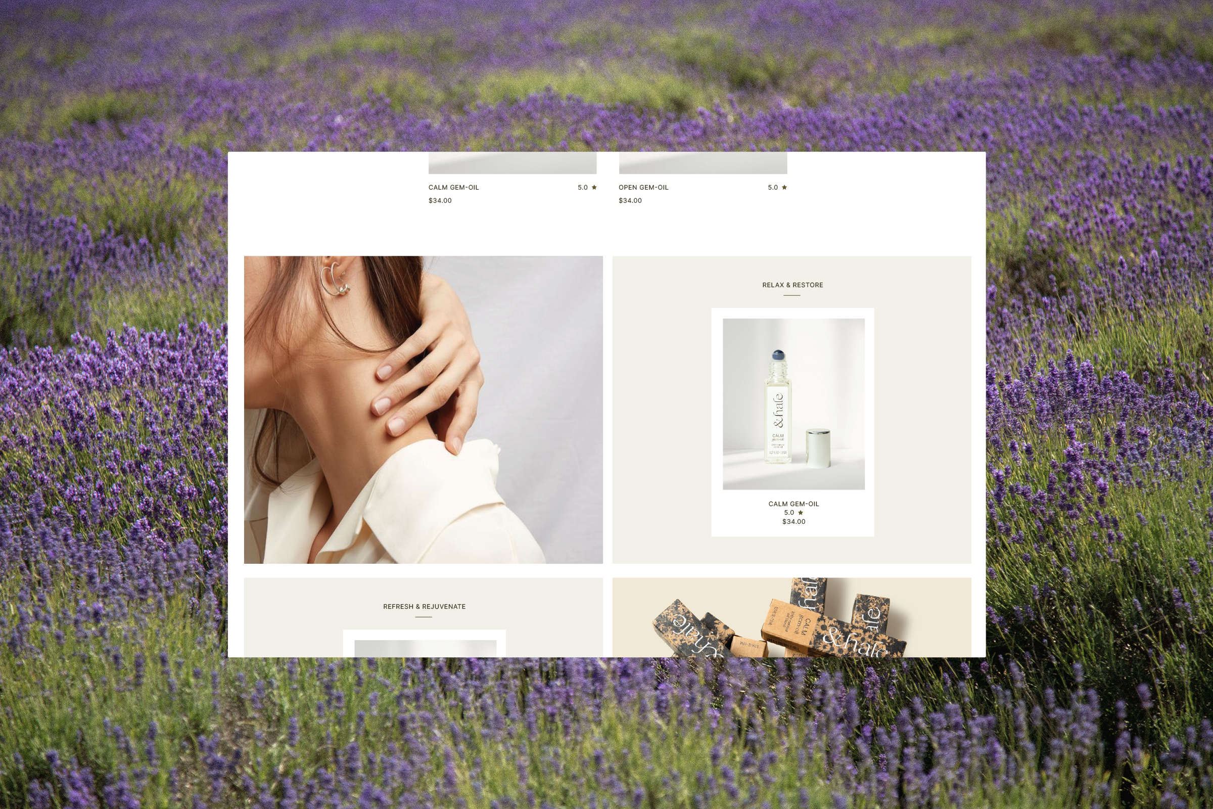
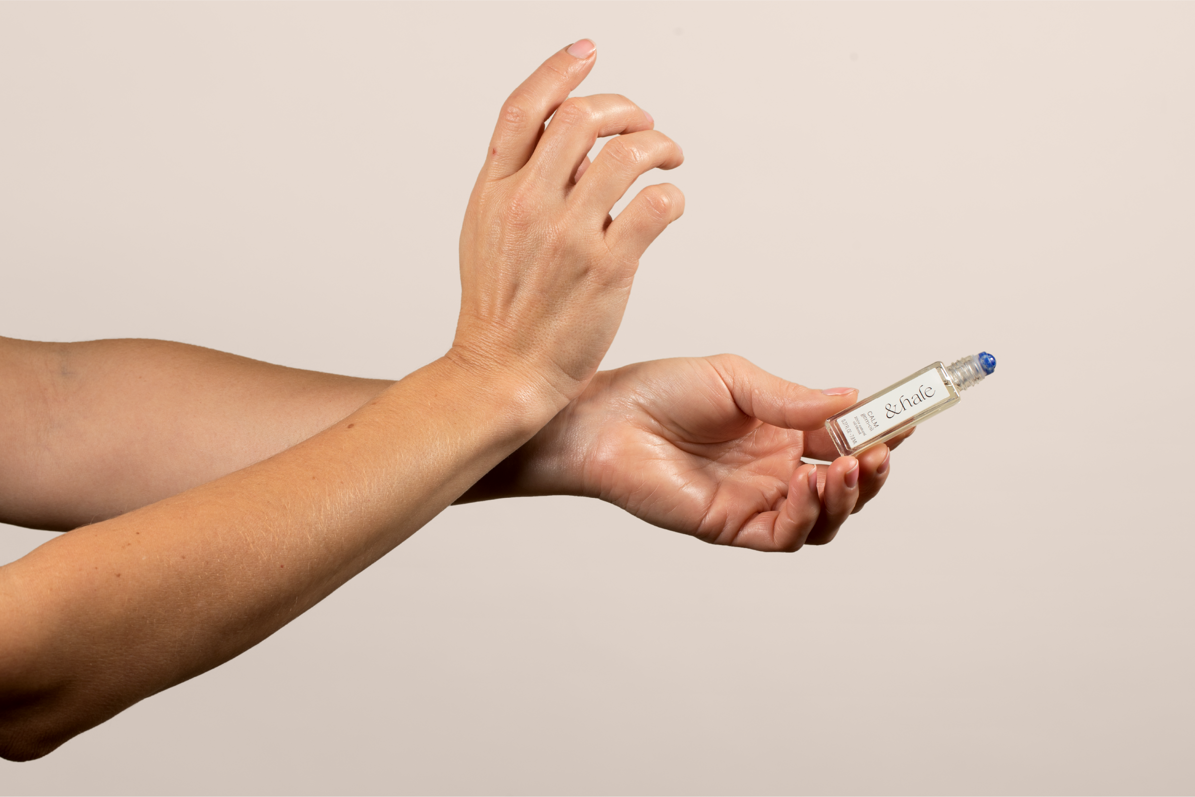
andhale’s photo style is visually light, using shadows and textures as dynamic elements with a focus on ingredients and packaging. The site - built on Shopify – is a streamlined design that utilizes the brand’s visual toolkit and lets the brand photography shine.
Finally, the brand’s launch assets were focused on Instagram. Custom, one-off posts and templates were created to utilize brand assets and complement stock photography. The result is an engaging and varied look for social media.